Lake House Process
This is a small insight to some of my process for the brand identity of Lake House
Typography Discovery:
For the typeface, I researched for a long time trying to find a typeface which had enough character to allow the studio to be unique. What I was looking for was a san serif type face with a little bit of flair. To start with I went and found 9 typefaces and then broke them down. This resulted in me picking Satoshi. It is a great typeface but after a lot of research and looking for more typefaces we found one which we thought was better a better fit.


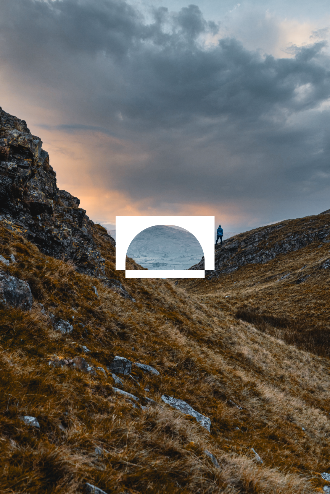
Concept 1:
For this concept I spoke to the founder of Lake House and we discussed the original concept behind Lake House. It is based upon the Lake Districrt, UK and how we lived there. Therefore, this sparked something for me to try and bring that identity into the brand. After doing some more research and being inspired by the National Gallery of Prague I came up with this concept of removing the O and U in ‘House’ to allow space for abstract symbols which relate with the Lake District. For example, the walls, brick work, bridges, chimneys and other elements of the Lake District.